


Flexbox
Flexbox, short for Flexible Box, is defined in the CSS Flexible Box Layout Module specifiation.
It allows you to control the layout in a parent container. It offers some useful settings, which allow you to control the alignment of the items and to distribute the extra space. Flexbox is one-dimensional. That means it lays out its items in one dimension - either horizontally or vertically. An example of a two-dimensional layout can be CSS Grid.
Flexbox is a powerful tool, which allows you to control layout in a way that was previously very difficult or possible only using hacky solutions.
Flex container
With Flexbox, we have to consider both the element itself and also its children. That's because Flexbox is mainly focused on how its children (flex items) are positioned within the main element (flexbox container).
<div class="flexbox-container">
    <div class="flexbox-item">1</div>
    <div class="flexbox-item">2</div>
    <div class="flexbox-item">3</div>
    <div class="flexbox-item">4</div>
    <div class="flexbox-item">5</div>
</div>
It is important to grasp the concept of flexbox-container and flexbox-items. That's because some properties for Flexbox are applied to the container level and some for the individual items.
Without any CSS styles, the code above will display all the flexbox-items under each other. Each item will span the whole width available. That's because div is a block element, and it is how block elements behave.
Let's try to turn the flexbox-container to Flexbox. All we have to do is to add the following style:
.flexbox-container {
    display: flex;
}
Now the layout will be different. All the items are now displayed horizontally, from left to right. I've also added some background colors and borders, so you can better see the layout.
The display: flex; property is always applied on the container level, not the item level. It defines that the container should lay out its children using Flexbox.
Block vs. inline Flexbox
Flexbox is slightly different from positioning normal elements using display property. If we use display: block; or display: inline; we define how the element should be displayed in the document flow.
When we defined display: flex; we saw that it affected how the children are displayed in the flex-container. But what about the container itself - how is it displayed? Is it inline element, or is it block?
- Span the whole width available
- Are positioned one under another
- Can have properties such as width and height
- Examples: div, h1, ul
- Are positioned on a line next to each other, from left to right
- Take only as much space as required by their contents
- Ignore properties such as width and height
- Inline-block elements behave as inline elements, but you can also specify properties such as width and height
- Inline elements example: span, b, i, label
Actually, we have two options when using Flexbox. We can make the container either inline or block element using:
display: flex;display: inline-flex;
If we want to our container to be displayed inline, we use display: inline-flex;. If we want it to be displayed as a block, we use display: flex;.
Note that display: inline-flex; behaves actually as inline-block rather than inline. That means it is still displayed on a line, but you can define properties such as width and height.
Be aware that this defines only how the container should be displayed in the document flow, not its child items.
Flex direction
In our example, the child items were displayed horizontally, from left to right. That's the default behavior, if you don't specify otherwise.
You can control the flow direction of flex items by defining flex-direction. This is done on the container level, not the item level.
row(default, horizontal, from left to right)row-reverse(horizontal, from right to left)column(vertical, from top to bottom)column-reverse(vertical, from bottom to up)
When we did not specify flex-direction, it used the default value, which is row. For horizontal placement, but from the other direction, you can use row-reverse. For vertical, you can use either column or column-reverse.
.flex-container {
    display:flex;
    flex-direction: column-reverse;
}We said that row means horizontally, left to right. It is not entirely true, though. It applies in languages, which have writing order from left to right. In languages, which use the opposite order (right to left), the Flexbox row setting would follow that direction. This means that in languages, such as Arabic, flex-direction: row; would actually order items from right to left instead of left to right.
Main vs. cross axis
To better understand some of the following concepts, we need to introduce some more terminology. Flexbox uses two axes. The main axis and the cross axis. They are perpendicular to each other.
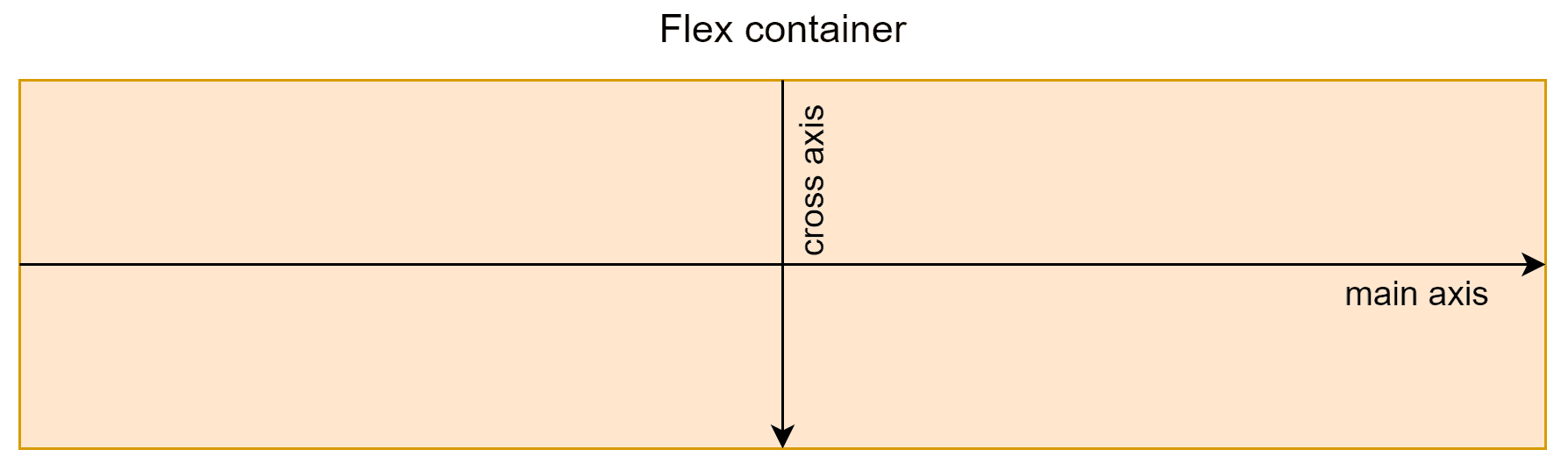
- The main axis is horizontal in row mode and vertical in column mode
- The cross axis is vertical in row mode and horizontal in column mode
The direction of each axis depends on the writing mode (left to right in English) and flow-direction.
- Main axis is left-to-right in
rowand right-to-left inrow-reverse - Main axis is top-to-bottom in
columnand bottom-to-top incolumn-reverse - Cross axis is top-to-bottom in
rowandrow-reverse - Cross axis is left-to-right in
columnandcolumn-reverse
Justify content
In our previous examples, all the items were aligned to the flex-start - that is to the left when displaying as a row and to the top when displaying as a column. This is the default behavior, but you can change it with justify-content property. For alignment, you can use the following values:
flex-start(default)flex-endcenter
It allows you to align items on the main flex axis, that is:
- horizontally when the
flex-directionisroworrow-reverse - vertically when the
flex-directioniscolumnorcolumn-reverse
Because you can have either normal or reversed flex order, you can't specify alignment as left, right, top, or bottom. Instead, you work with flex-start and flex-end, which depends on whether you are in normal or reverse mode.
Distributing extra space
The justify-content property can be used not only for aligning items, but also for spreading items evenly across all the available space on the main axis.
You can use these values:
justify-content: space-between;justify-content: space-around;justify-content: space-evenly;
In all cases, the items are distributed, so the space between neighboring items is always the same. The three values differ only in a way how the spacing between first and last item and the edge of the container is calculated.
space-between;: first and last items have no space relative to the edge of the containerspace-around;: half of the space compared to the gaps between itemsspace-evenly;: same space as between items
Align items
We learned how to align items on the main axis using justify-content. What about the other axis, the cross axis?
The cross axis is the axis perpendicular to the main axis, that means:
- in
rowmode, the cross axis is vertical - in
columnmode, the cross axis is horizontal
You can use align-items property on the container level to define cross-axis alignment. There are several properties you can choose from:
flex-start: align to the start of the cross axis- top in row mode
- left in column mode
flex-end: align to the end of the cross axis- bottom in row mode
- right in column mode
center: align to the middlestretch: stretch the component to fill the available space on the cross axis (respectsmax-widthandmax-heightof items)baseline: items are aligned by their baselines
This works as expected and is self-explanatory, considering what we've already learned. The baseline setting is a bit trickier, though. It aligns items by their baselines. The following image from Wikipedia shows this nicely.
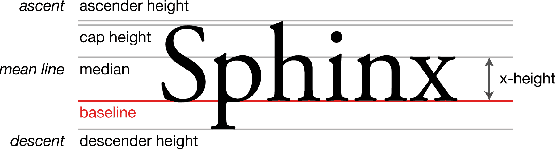
Let's look at a specific example:
As you can see, the baseline, in this case, is usually the bottom of the first line of text in each item. The bottom here means where most of the regular letters end. There are some letters such as p or j. that go under the baseline.
Note how multiline items and items with no content are handled. You can check more details about the baseline calculation in Flexbox.
Wrapping
So far, our flex container was big enough to fit all of its content properly. But what happens if there are too many items, which do not fit the size of its parent container?
By default, the container tries to shrink the items if possible, but eventually, the items may overflow out of the container. Note that the container tries to shrink items when not enough space is available even though we explicitly set width: 50px;. This width is preserved only if there is enough space. We'll learn how to control or disable this behavior a bit later using flex-shrink.
This may be ok in some cases, but usually, you want more control over how this case is handled. You can also use flex-wrap property on the container level to specify how the wrapping of items should be handled. There are three possible values:
nowrap- (default) one line, may overflow the containerwrap- wrap to multiple lines from top to bottomwrap-reverse- wrap to multiple in the opposite order from bottom to top
The difference between wrap and wrap-reverse may be confusing, let's better look at an example.
Aligning wrapped content
When items are wrapped in a Flexbox, and you have, therefore, multiple lines, you can control how these lines are aligned on the cross axis. You can use property align-content.
Do not confuse this with align-items and justify-content.
justify-content: aligns across the main axis- the main axis is horizontal when in row mode
- the main axis is vertical when in column mode
align-items: aligns items within a row on cross axis- the cross axis is perpendicular to the main axis
align-content: aligns wrapped lines across the cross axis- used to align multiple wrapped lines; for regular cross axis aligning, we can use
align-items
- used to align multiple wrapped lines; for regular cross axis aligning, we can use
The good news is that the possible values of align-content are very similar as with justify-content:
stretch(default)flex-startflex-endcenterspace-betweenspace-aroundspace-evenly
The alignment just works on the other axis, but the behavior is the same.
Item level properties
So far, we've covered properties, which are defined on the flex container level. Now let's look into properties, which are defined on the level of individual flex items.
Aligning individual items
So far, we covered several options for handling alignment:
justify-content: align items on the main axisalign-items: align items on the cross axisalign-content: align multiple rows when wrapping on the cross axis
All these settings apply for the whole container. It is possible to also handle the alignment of individual items on the cross axis. This is defined on the item level, not the container level. It uses property align-self. You can use the following values:
flex-startflex-endcenterstretchbaseline
Of course, this can be combined with defining alignment on the container level using align-items. You can define general alignment for the items on the container level, and then override it for individual items. For example, you can define items to be aligned for the whole container using align-items: flex-end; and then change the alignment for individual items using align-self.
Ordering items
Items in the flexbox container are not necessarily displayed in the order, in which they are declared in HTML. That is, you can reorder items by assigning them specific order property. This is an integer value and defaults to 0 if not specified otherwise. This property is set not on the flex container level, but at the item level, as you want to order individual items.
If you want to put items before those, which don't have order specified, you can use negative values.
Multiple items can have the same order value. Such items belong to the same ordinal group. Items within the same group are then ordered in the same order in which they are declared in HTML.
For example, if you have three items with order 1, they will be placed after all the items with the lower order. All these three items with the same order value will then be placed in the same order as in HTML.
Visual, not logical order
You have to be careful when changing the order in a flexbox container this way. This only changes the visual order of the items, not logical order. In other words, in DOM, the items are still placed in the same order as in HTML.
This has several implications. Most notably, any assistive technologies such as screen readers will process the items in their original order. This also applies to keyboard navigation using Tab key, unless you also explicitly change tab-order of your components.
Flexibility
One of the most powerful features of Flexbox is the ability to adjust the size of the items inside based on the size of the container. This means:
- You can enlarge the items to fill all the available space
- You can shrink the items to fit when there is not enough space
This is very powerful as all the items are automatically resized when the size of the flex container changes. Moreover, you can define resizing behavior per each item inside the container. For example - some items can grow more, some items less, and some not at all.
Flex-grow
Using this property, you can control how items should grow when there is extra space available. The default value, if not specified otherwise, is flex-grow: 0. That means that items will not grow to fill the extra space on the main axis by default.
However, this can be changed by assigning any numeric value greater than 0. Negative values are not allowed.
Let's say we assign flex-grow: 1; to all items. This means that the extra space will be assigned proportionally to each item in a way that each item gets the same amount of extra space. This is because their flex-grow values are the same.
So what does the value actually do?
Extra space available is distributed among the components proportionally to their flex-grow values.
This means if there are two items, and both have flex-grow: 1; they both get 50% of the available space. That's because the ratio of their values is 1:1.
If one item has flex-grow: 3 and the other one flex-grow: 1, the ratio of their values is 3:1, which means he first one will get 3x as much as space (75%) as the second one (25%). If there are 100px of extra space, the first component will get grow by 75px, and the second one will grow by 25px.
The common misconception is that ratio, let's say 2:1, means that the first component will end up being twice as big as the second one. But remember, it is about how the extra space is distributed, not the final size. The ratio of flex-grow values determines the percentage of the extra space each item will get, not their final sizes.
Values between 0 and 1
Values greater than 0, but less than 1 have special behavior. If the sum of all the flex-grow values in a container is less than 1, items will still grow, but will not fill the entire container.
For example, if we have three items, each with flex-grow: 0.25; their sum is 0.75. This means that the items will grow, but only occupy 75% of the available space, the rest will be empty.
In the example above, we have two items with value 0.1 and one with 0.4. The sum is 0.6. That means that only 60% of extra space will be occupied while the items with 0.1 will get 1/6 of space each, and the item with 0.4 will get 4/6 of distributed space.
In other words, 20% of extra space will get two items with 0.1 (each 10%), 40% will be added to item with 0.4, and the rest of 40% will stay unoccupied.
Flex-shrink
This property determines how items should be reduced in size if there is not enough space available in the container.
Again, it is a non-negative numeric value, where 0 means no shrinking at all. The ratio of these values determines how much each item will shrink compared to others. The difference is that the default value is 1. This means that the items will shrink by default (but they don't grow by default).
We already encountered this with wrapping - items shrink only to certain degree, so they can still fit their content. After that point, these items will overflow unless you specify wrapping.
There is one more notable difference between flex-grow and flex-shrink. In addition to ratios (same as with growing), the base size of each item is considered when determining how much each item will shrink. This means even if the flex-shrink value is the same, bigger items will shrink more than smaller items.
In other words, larger items (which are able to shrink more) will shrink faster than smaller items (which have limited space left for shrinking).
Flex-basis
When calculating shrinking and growing in a Flexbox, it is important to know the size of each item on the main axis. For example, to calculate the space available for growth, you need to take the size of the flex container minus sizes of all the items. How are the sizes of individual items calculated, though?
- You can specify
widthorheightof items - If not specified, the items are sized based on their content
You can also specify flex-basis property, which is used for sizing. It can use the same values as width or height. You can see, that width and height are two properties for horizontal and vertical sizing. But there is only one flex-basis. That's because it controls sizing on the main axis. This means if you are in row mode, it controls width. In column mode, it controls the height. So even if you switch between rows and columns dynamically, you can still use the same flex-basis property.
The behavior of flex-basis is the following:
- it defaults to
auto autouses either specifiedwidthorheight. If these are not specified, it uses sizing based on contents of the item- it overrides any
widthorheight - it respects min/max width and height
- you can also use
contentvalue, which uses automatic size based on content (it was not present in the initial spec, and older browsers do not support it)
Shorthand properties
Although you can specify flex properties such as flex-grow or flex-shrink individually, there are some shorthand properties, which allow you to combine multiple individual properties together. Using shorthand properties is usually a preferred way instead of defining the properties individually.
Flex-flow
This property allows you to combine flex-direction and flex-wrap.
flex-flow: flex-direction flex-wrap;Of course, you need to provide specific values instead of flex-direction and flex-wrap:
flex-flow: column wrap-reverse;

/* Equivaluent css without using shorthand flex property: */

flex-direction: column;
flex-wrap: wrap-reverse;
Flex
This property allows you to combine the following individual properties together:
flex-growflex-shrinkflex-basis
It is defined like this:
flex: flex-grow flex-shrink flex-basis;You need to substitute flex-grow, flex-shrink and flex-basis with specific values here:
flex: 1 2 100px;

/* Equivaluent css without using shorthand flex property: */

flex-grow: 1;
flex-shrink: 2;
flex-basis: 100px;
There are also several options to specify less than three values.
One value
With one value, you can use:
flex: auto;- equivalent toflex: 1 1 auto;flex: none;- equivalent toflex: 0 0 autoflex: [positive number]- defines justflex-grow, the rest uses default values; equivalent toflex: [positive number] 1 0px;
Two values
You can also specify just two values instead of 3. In this case, the first one is always flex-grow. The second one depends on the type of value that you provide.
- number (eg.
flex: 1 1;) is interpreted asflex-shrink, flex basis defaults to 0px in this case - valid size value (eg.
flex: 1 100px) is interpreted asflex-basis, flex shrink defaults to 1
Note when using flex shorthand,flex-basis defaults to 0, if not specified. This is different from the default value of flex-basis, which is auto.
Shorthand or individual properties?
This shorthand is preferred over defining the properties individually, as stated in the spec.
Authors are encouraged to control flexibility using the flex shorthand rather than with flex-grow directly, as the shorthand correctly resets any unspecified components to accommodate common uses.
Firefox DevTools
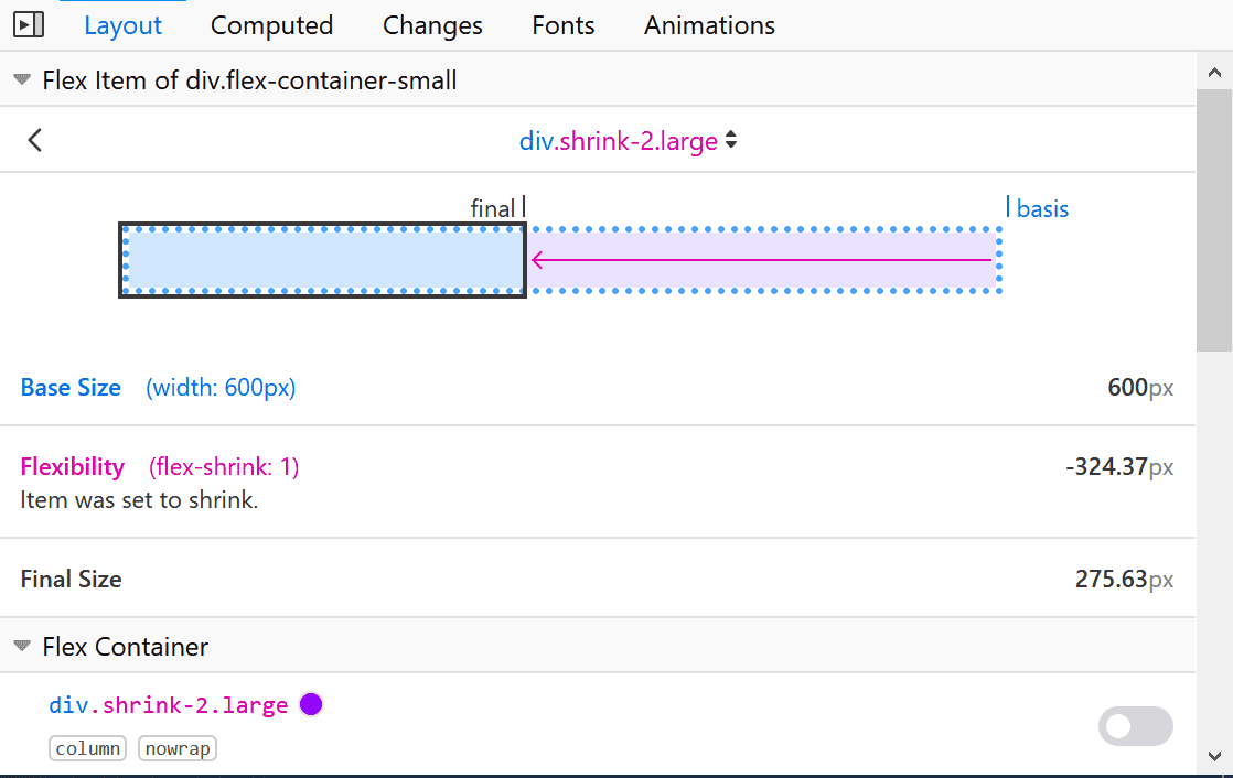
If you want to tinker with Flexbox settings, Firefox developer tools offer powerful support for Flexbox debugging and visualization. Check it out.
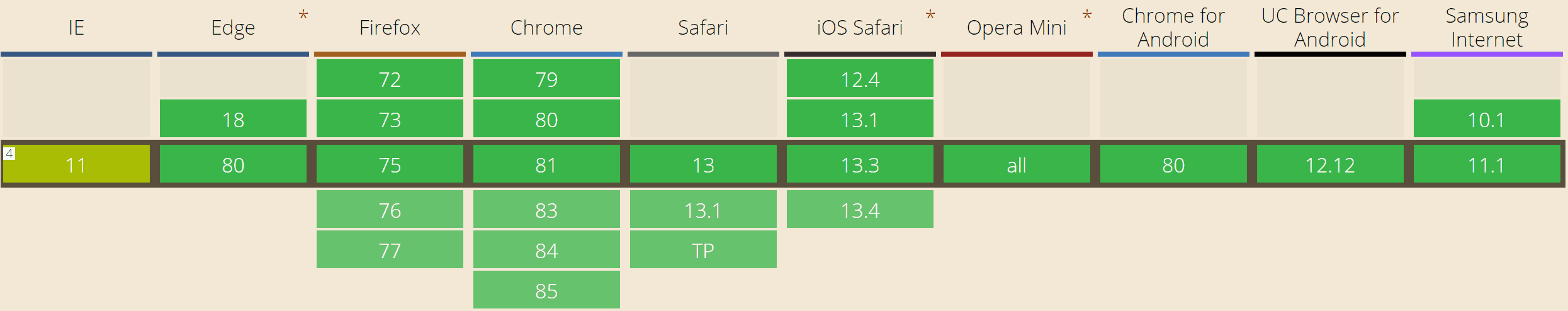
Browser Support
Fortunately, Flexbox currently has great support across all the major browsers. That is 98.72% of all the users. It is even supported by IE 11, even though it has many issues and some non-standard behavior.
If you are targeting some old browsers, you can check Advanced Cross-Browser Flexbox.
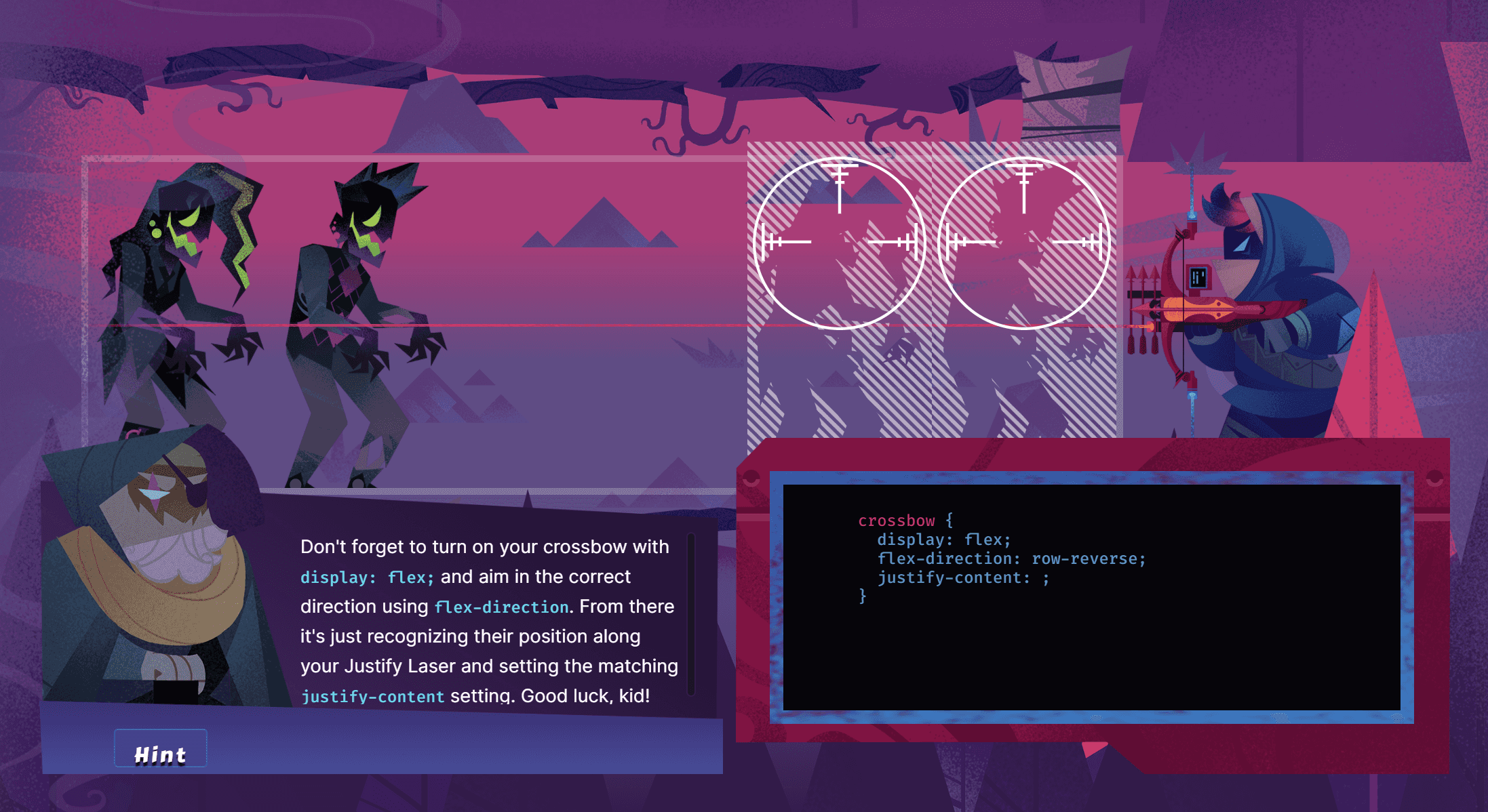
Learning flexbox with zombies
Learning Flexbox is way more fun if there are zombies involved. Instead of reading boring tutorials, you can shoot zombies with your crossbow, while learning Flexbox. Try Flexbox Zombies browser game. It is for free.
Want some more practice? You can check other games helping you to master Flexbox, such as Flexbox Defense - a tower defense game where you position your towers using CSS and Flexbox. Another one is Flexbox Froggy - help Froggy and his friends to reach lilypads and cross a pond by writing CSS code.
Additional resources
- Flexbox specification
- Solved by Flexbox - showcase of common layout problems solved by Flexbox
- Interactive Flexbox playground for testing various flex properties
