


Position property
Positioning elements with CSS can be tricky. There are various ways to achieve the desired placement. One of them is the position property.
Based on its value, the position of an element can be calculated in different ways, such as relative to its normal position, relative to its parent or to the whole page.
The position property can have any of these values:
- static
- absolute
- relative
- fixed
- sticky
We'll cover the details of these values a bit later. As with other properties, you can specify inherit, which means the value is determined from the parent element. This can be useful as, by default, position does not cascade to its child elements.
Placement properties
Position property on its own is not that useful. It only says how the position should be calculated. For example, relative to the normal position of an element.
But we also need to define where exactly the element should be placed, not only how. There are several properties we can use for that.
- top
- left
- right
- bottom
These define how much the element's position should be adjusted and in which direction.
Position values
Now let's dig deeper into how different position values work.
static
This is the default value, which is used if you don't specify anything else.
Even though it is a default value, it can sometimes be useful to set it explicitly. For example, to override different position value, which is set elsewhere.
Unlike with other position values, when using static, properties such as top, left, bottom, right, or z-index have no effect.
relative
Relative position means that the element is placed relative to its original position in the page. When you set just position: relative;, nothing will change. You also need to define how should the placement of the element change relative to its original position. This can be achieved using top, bottom, left and right properties.
For example, top: 20px; means that the element will be moved down 20 pixels from its original position. In other words, it will be placed 20 pixels from the top edge of its original position.
In the example below, gray squares mark the original position of each element before it was moved using position: relative;.
As you can see, the space required for the original location of the element is still allocated.
As a result of an element being moved from its original position, there can be a situation, where multiple elements overlap each other. Fortunately, with z-index property, you can control which elements should be in the front and which in the back. We'll discuss this in more detail later.
absolute
Absolute positioning is trickier. Unlike with the relative position, elements are removed from the normal document flow, and their original space is not reserved.
Using top, bottom, left, and right properties, you determine where the element should be placed relative to the first parent in the element hierarchy, which has position set to anything else than static.
If there is no such parent, it is set relative to the whole page.
Each orange box is positioned relative to the gray container box. This is possible because the container has position set to relative. If the container's position was static, the orange boxes would be positioned relative to the whole page.
Another important behavior to notice is that we explicitly set the height of the gray container to 200 px. That's because, unlike with relative position, absolutely positioned elements are removed from the normal document flow and don't occupy any space when calculating the size of the parent container.
When we don't specify the height of the gray container box, it will collapse to zero as it does not contain any elements, which are used to determine its size.
fixed
Fixed positioning is similar to absolute in a way that the element is also removed from the normal document flow, and its original space is not reserved.
The position is determined relative to the viewport. This means that even if you scroll, the element preserves its original location on the page. This can be useful, for example, if you want to have a navigation bar, which is always visible on the top, no matter where you are on the page. Or a cookie info bar on the bottom.
Although this can be tempting, be careful with its usage. On a mobile device with a small screen, it can be a big deal if a large portion of your screen is always covered with a navigation bar or something similar. It dramatically reduces space for the actual content of your page and can significantly limit usability.
sticky
The sticky position is the latest addition to the list of position properties. It is a hybrid between relative and fixed positions.
The element is normally positioned on the page, but when you reach its position when scrolling, its position becomes fixed. It sticks to its location and stays there when you scroll further.
Browser Support
The sticky value is not universally supported.
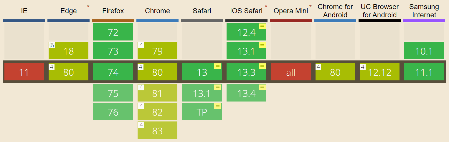
For example, Internet Explored does not support it at all. With Safari, you can use it, but you need to use vendor-specific prefixed variant position: -webkit-sticky;. Therefore for maximum compatibility, you should use both:
position: sticky;
position: -webkit-sticky;
If you need to support IE as well, you can use a polyfill such as StickyBits or stickyfill.
z-index
When working with position other than static, elements can easily appear in position, where they overlap each other.
In such cases, it is handy to have control over the order of these elements. That is - which elements should be displayed in front and which in back.
Fortunately, this is quite easy with a property called z-index. It controls the position of your elements on the z-axis. That is, which ones are in front of other elements and which ones are in the background.
You can use z-index like this:
z-index: 1;The elements with higher z-index are displayed in front of elements with lower z-index.
In the example, you can see that you can also specify negative numbers, which places these elements behind those with no z-index or index with value 0.
Summary
Let's sum it up. The position property allows you to determine how elements should be placed on the page.
You can define the exact location using top, bottom, right and left properties.
In case your elements overlap each other, you can change their order using z-index. The higher the index, the closer is the element to the user.
static
- Default value
- Positioning as usual, same as if you didn't specify the position
relative
- The element is placed relative to its normal position on the page
- The place occupied by the element is preserved at its original location
absolute
- The element is removed from the normal flow and does not occupy space
- The location is determined relative to the first parent set position (other than
static) - If there is no such parent, it is determined relative to the whole page
fixed
- The element is removed from the normal flow and does not occupy space
- The location is determined relative to the viewport
- Elements keep their locations as you scroll
sticky
- Elements are positioned relatively until you reach them by scrolling
- Then the elements stick to one location, similar to fixed positioning
- Not supported by all the browsers, you can use polyfills
